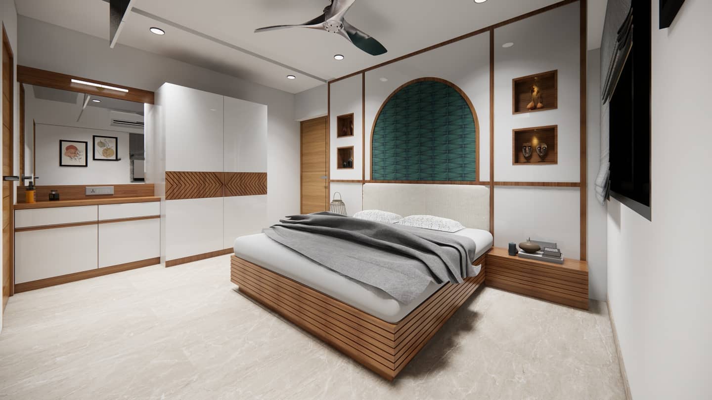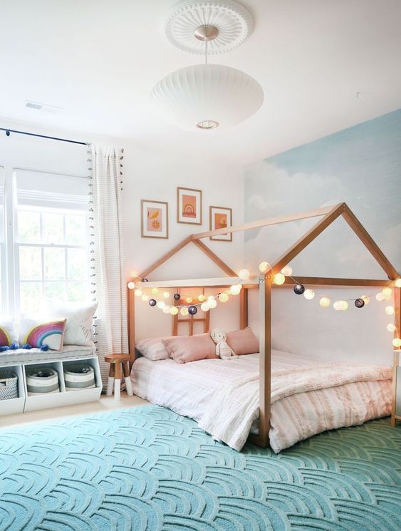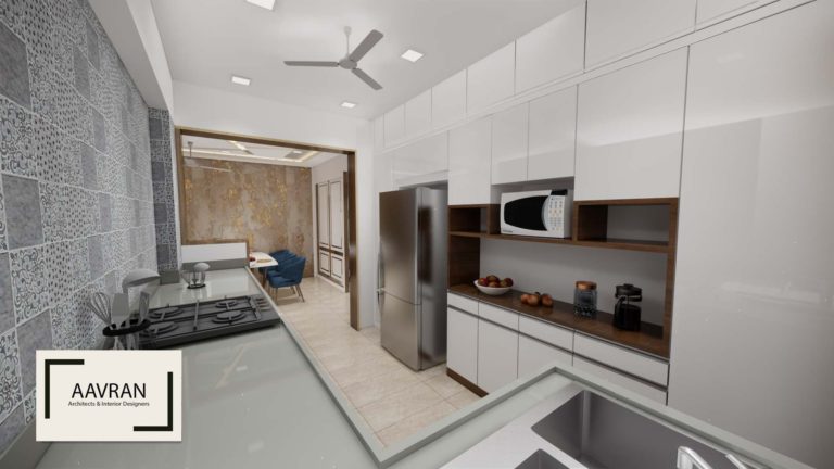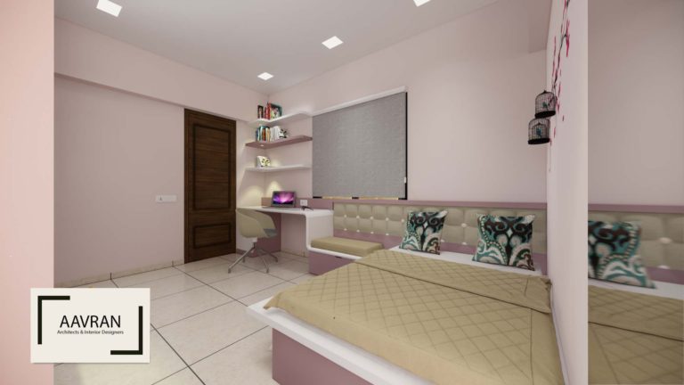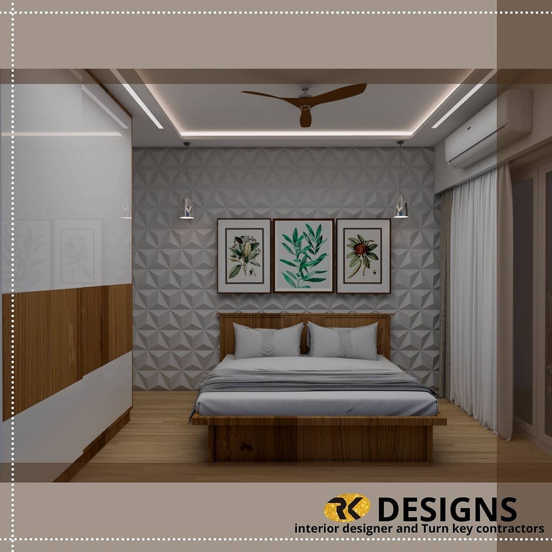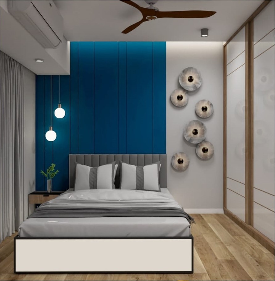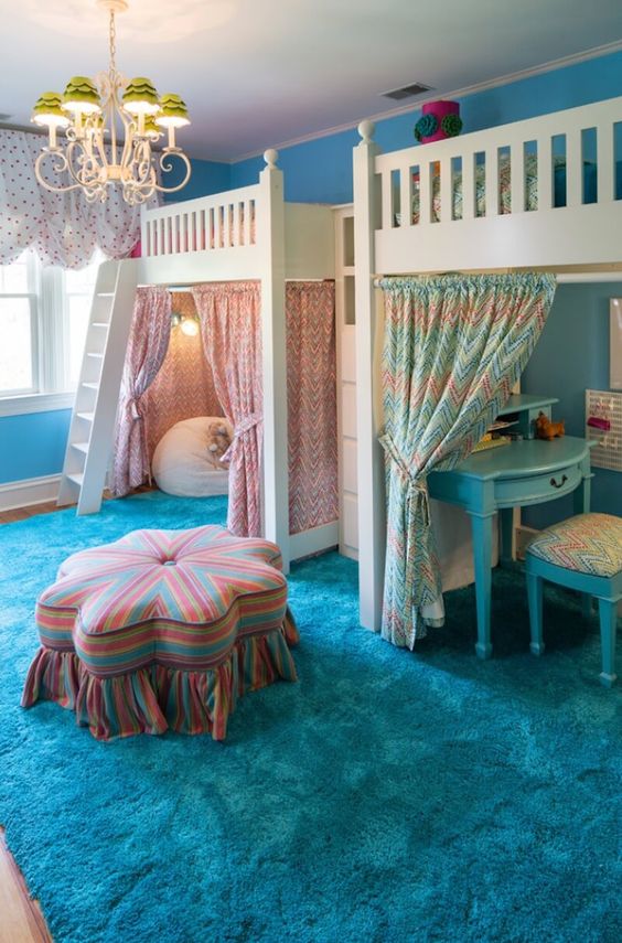
There are lots of colours available in market while you want to paint your home. Sometimes it happens that lots of options will put you in confusion for selecting the scheme of your home. There are various colour combination and finishes available in colour paint card to sample pots of paint. There are also certain visual tricks.
Here are Some Tips to Guide You to Select the Perfect Colour Scheme:
01. Colour Card & Sample Pots:

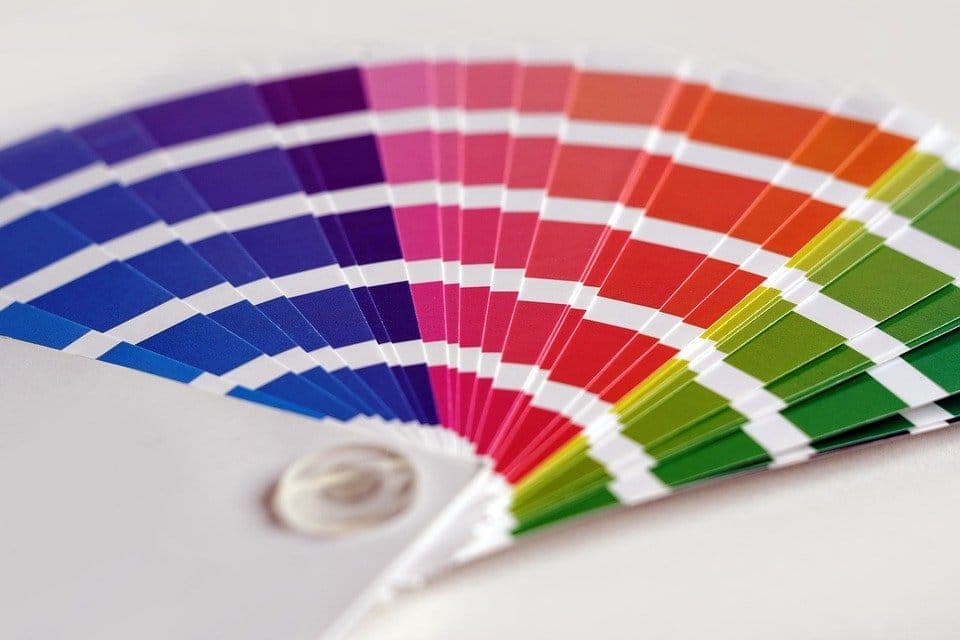
The first step in selecting colours for your home is to look at the brand in (manufacturer’s) colour chart or colour card. Though this is not the best way to choose paint. Because the rectangle print sample of the colour on the card will neither be the exact nor represent the one which appear on wall. They are very small and are positioned on the white background, which will give the false impression of brightness. Also remember that the tiny rectangle or square of colours will differ immeasurably from the one reflected or absorbed by an entire wall of that colour. For example, Blue will appear dark because it absorbs more light and yellow will seem much brighter because it reflect more light.
In response to that, paint makers have introduced small sample pots of the paints which will provide an option to experiment with your chosen scheme on the wall itself. Sample can be used together with your furniture, curtains and wall covering to visualize a room as whole.
02. Visual Trick Colour Scheme:
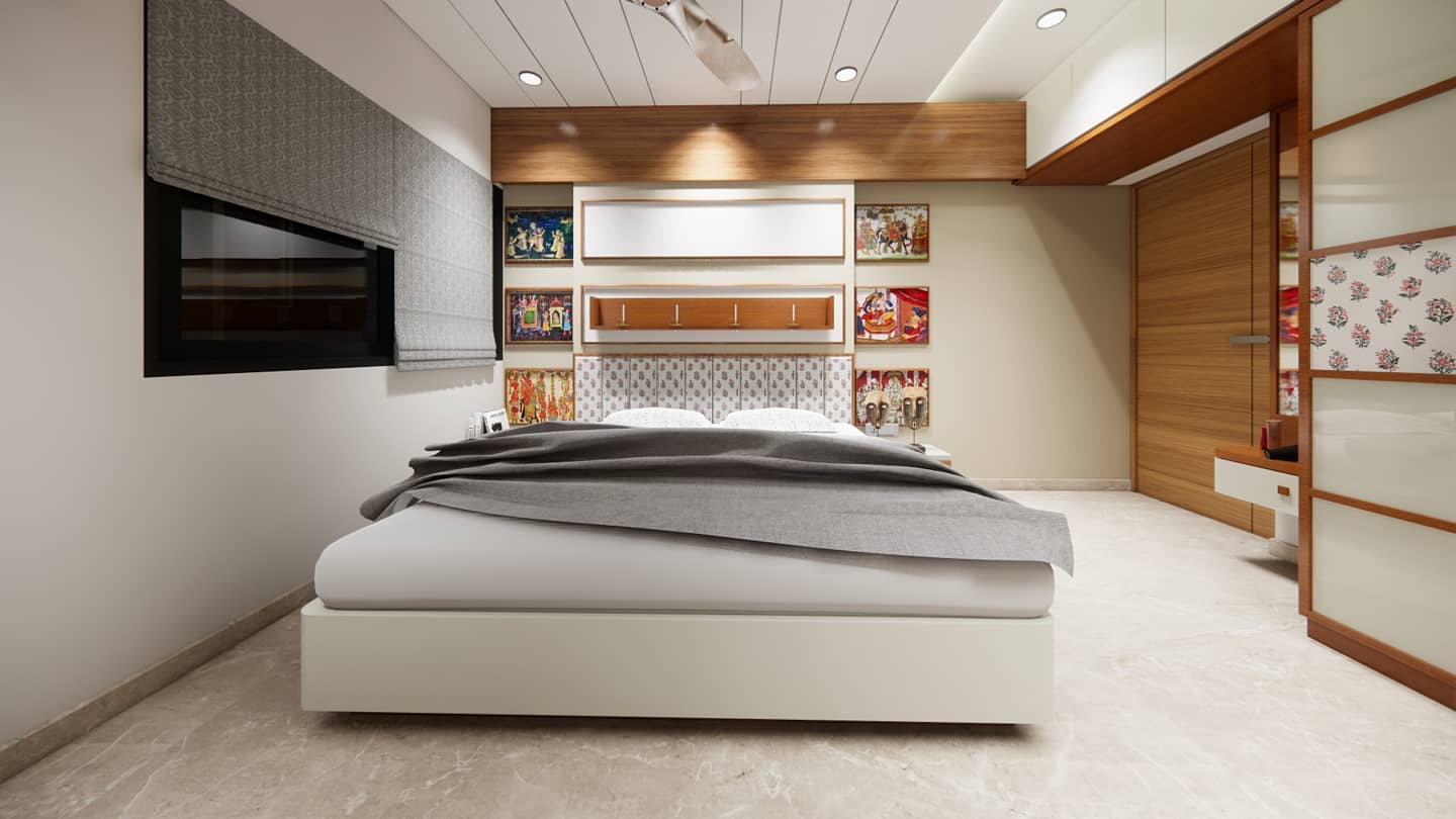
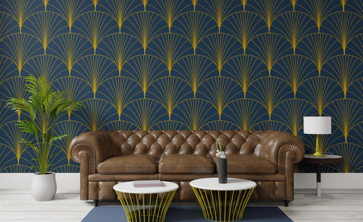
Colours of different reflective qualities will allow to play visual tricks with the size and proportions of the space and their interconnecting areas. For example, paint one wall in cool blue; it will visually give appearance to lengthen the room. Conversely, paint one wall in and another three in white and that wall will appear to shortening the room. If your ceiling is too high, paint it in a dark colour, the ceiling will appear lower. The opposite effect is achieved by painting a ceiling white to heighten it.
You can make wall to appear higher by painting it’s skirting with same colour of wall. When all the walls and ceilings are of same light colours, the natural angles of the space are much less noticeable. This will give a feeling of increased space.
If your rooms are connected by narrow corridors as in many older houses, light colours will help you to increase the width visually. A darker colour at the end of a corridor will make it seem shorter.
03. Monochromatic Scheme:

If you are thinking to do monochromatic scheme then the colour you choose must in a strong relationship with the fabrics, soft furnishings and flooring. Neutral grey, soft beiges, off white and creams are frequently chosen for this. The term “monochromatic” is a misnomer, because patterns on floor covering and soft furnishing, wood and general household pieces have their own colour content.
04. Swatch Watch:

When working on particular space, designer will make a swatch or sample board consisting of colours, materials, fabrics, wallpaper onto a card to assist the decision making process. It is easy to put one together by collecting sample from shops. Use the materials and paints you are considering, never substitute a cut down from the magazine because this will not be accurate. The artificial light should ideally be the lighting system that you are going to use in the space. If it is going to be different, then find the closets match of it.
When your board is complete, use it to compare with lights and note down the changes in colour and its bright sunshine, dull, shadowy conditions under artificial light.
05. The Great Divide:
The house is divided into so many areas, and you may or may not have a preference for a colour linking system, that is to say linking all rooms on one floor by using the same colour for door frames and skirting etc. You can also keep these natural divisions and emphasize it by using different colour scheme.
So, you can divide the colour scheme for emphasizing it and also can give continuity by repeating that style in your home.
Now many of the retailer can give you a 3D view in photograph for different options of colour. This will help you in visualizing and weighing different options.


