Not everyone is an interior designer or interior decorator. But everyone can acknowledge about the various colour terminology used by interior designer or interior decorator. Getting your concepts clear regarding various terms used in colour theory will help you to better coordinate with your interior designer/decorator. This article will bridge the gap between you and various colour terms. The colour terms used here are in the context of home decoration/interiors.

So let us start with the definition of colour.
Colour:
Colour can be defined as the light emitted by that object. A red object emits red light, a green object emits green light, a blue object emits blue light, and the list goes on. In general, whichever colour is emitted by that object is perceived by eyes.
Additive Colour:
Red, Blue and Green are additive colours. On mixing any two of them a lighter colour is produced. When these lighter colours are further mixed; white colour is produced as end product. Also known as colour of light.
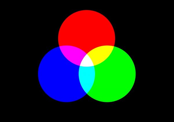
Subtractive Colour or Surface Colour or Paint Colour:
Red, Blue and Yellow are subtractive colours. These colours when mixed, black colour is produced. It is in contrast with additive colours.

Image Courtesy – Colourtherapyhealing
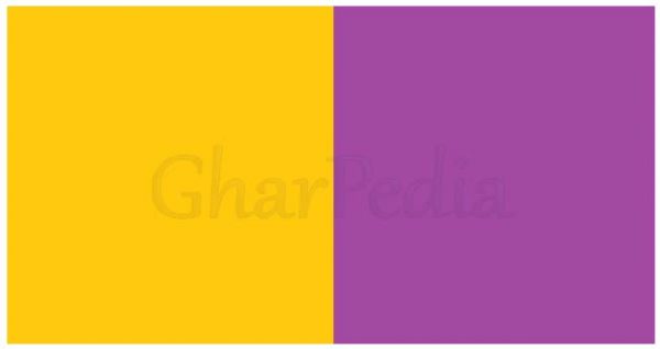
Clashes or Discords:
This describes two colours of equal intensity, which cause visual discomfort. For example: Golden Yellow and mauve clash with each other, producing a kind of visual discomfort.
Complementary Colours:
Colours opposite each other on the colour wheel are called ‘complementary’. These colours are of equal intensity. When placed alongside each other, they achieve maximum intensity and compete for attention. And when they are combined in equal proportions they make a neutral grey. For example: Blue and Orange appear directly opposite each other on the colour wheel and are known as complementary colours.
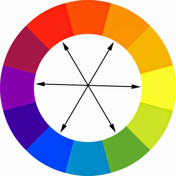
Image Courtesy – Copicmarkertutorials
Hue:
Hue means colour. But colour is general term used for all colours, whereas hue includes only those colours that are in colour wheel. The 12 hues are Red, Red-orange, Orange, Yellow-orange, Yellow, Yellow-green, Green, Blue-green, Blue, Blue-violet, Violet, Red-violet.
Hot and Cold or Warm and Cool:
Warm colour gives the feeling of warmth. They are Red, Orange and Yellow. As these colours reminds of sun and fire it makes one feel warm.
Similarly, Cool colour gives the feeling of coolness. They are green and blue. As these colours reminds of water and greenery it makes one feel coolness around.

Light and Dark:
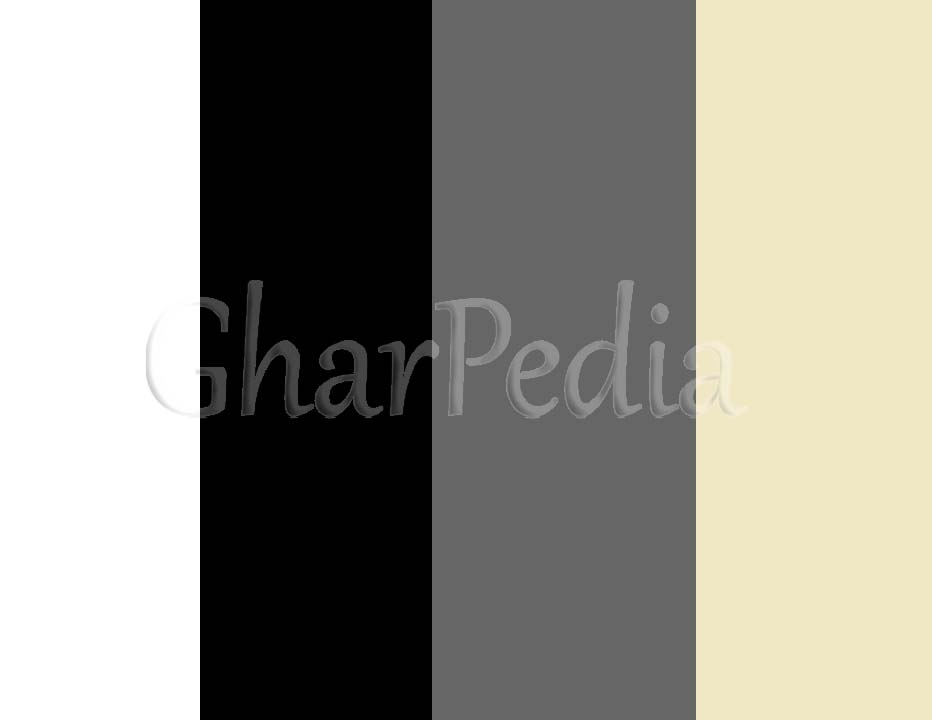
When you look at the coloured photograph and b/w (black and white) version of same photograph, the colours appearing white in b/w version are light colours and those appearing black are dark colours. And the colours having same tonal quality appear grey on b/w photograph. Figure is given below for illustration.
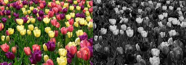
Image Courtesy – hddesktopwallpapers
Harmonies:
The combination of colours which allows the eye to travel smoothly between them with no sharp contrast at all. Colours which are close to each other on the colour wheel will naturally be in harmony.
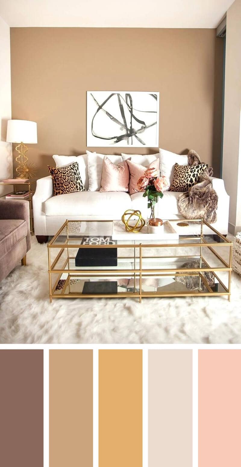
Image Courtesy – Homebnc
Intensity:
Intensity is all about the pigment in the paint. The more the pigment is there, the stronger and less diluted the colour will be. Another word used to describe intensity of colour is saturation.
Neutrals:
Black, white, beige, grey and cream are the neutral colours. Other neutral colours are formed by mixing two complementary colours and adding white, black or grey colour to the mix.
Tint and Shades are usually misunderstood. So here we have distinguished them.
Tint:
When white is added to any colour it lightnes the colour. This lighten colour is called tint.
Shade:
When black is added to any colour it darkens the colour. This darken colour is called shade.
Tone:
When grey is added to any colour it either lightens or darkens that colour. The colour formed is called tone.
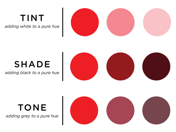
Image Courtesy – knitpicks

Saturation:
Saturation is the measure of pure colour excluding white and black colour from it. It tells the strength of colour. High saturation colours are rich and low saturation colours look dull and greyish.
Value:
Value refers to the brightness of colour. Brighter the colour higher is the value of colour. Darker the colour lower is the value or colour.
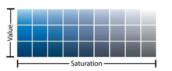
Image Courtesy – Sitepoint
Also Read:
10 Tips To Select Colour Scheme For Your Home
How Directions Affect Your Colour Selection and Mood?
Influences, Psychology & Meanings of Different Colours
5 Tips For Designing Colour Scheme For Your Home