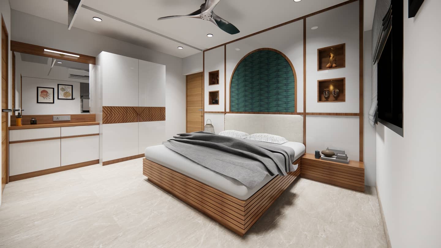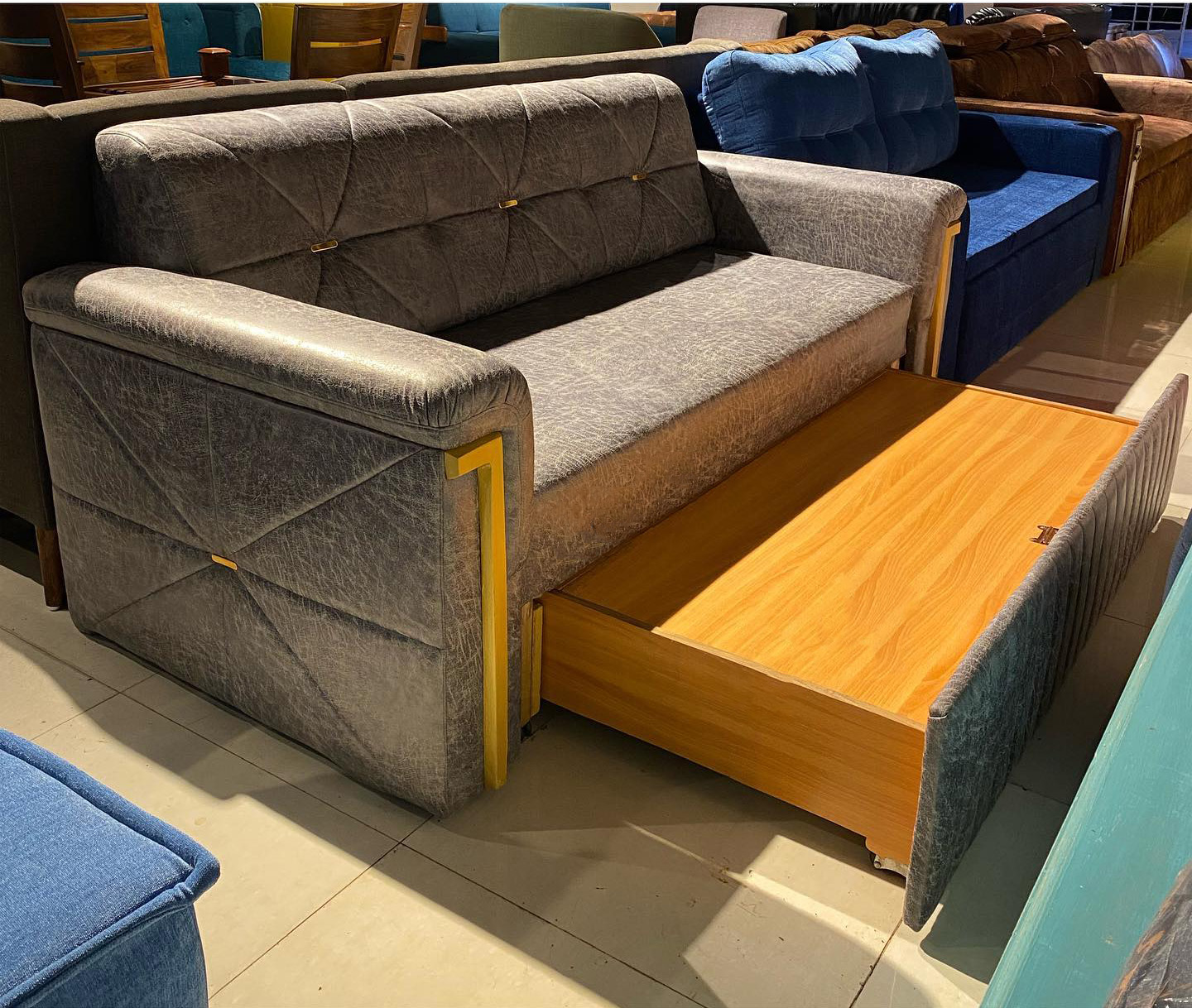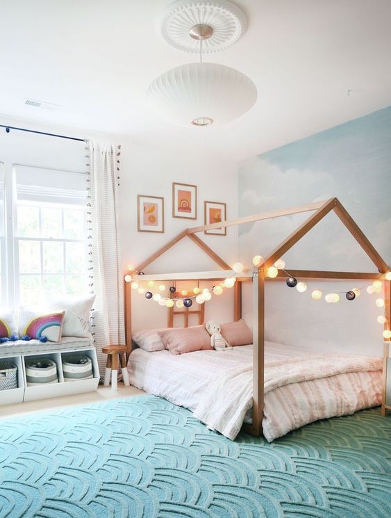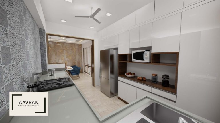
Whenever we hear about minimalism, most often we do get to hear a famous quote, “Less is More”. For the word described as having as little as possible, or the power of less, ‘Minimalism’ has come a long way over the past few decades. From being an addition to the terminology used in design to running into a common mandate, minimalism has only grown with time. It involves the usage of simple design elements and methods without any ornamentation or decoration to bring out the true essence of the space and its surroundings. architectural space through bare basic interventions.

Minimalism as a term emerged during early 1920 from the Cubist-inspired movement of Bauhaus and De Stijl that glamorized and announced its grand entrance in the design language. Many impacting famous architects like Ludwig Mies Van Der Rohe, Frank Llyod Wright, Adolf Loos, etc. emphasized Minimalism as a phenomenon that gives maximum power to architectural space through bare basic interventions.
The Cubist Movement
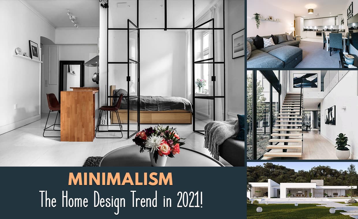
The Elevated Design Era from 1920 to – the 1930s saw a heavily influenced impact of the Bauhaus School’s ideal on balancing beauty with utility through product design. These movements re-imagined the role of art and its play in society. What started as a small shift in ideals on looking at designs, turned into a major uproar that shifted the entire dynamics of looking at spaces injecting thoughtfulness and creativity for everyday life. From product designs to interior design and architecture, Minimalism became relevant in every domain of design irrespective of its scale.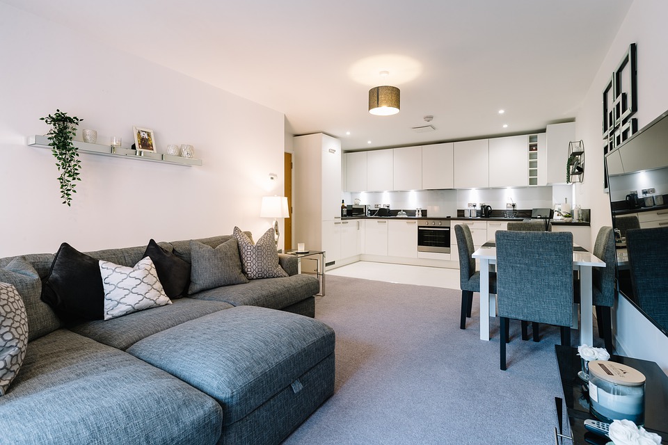
Minimalist Designs in Homes
Minimalism as a term started gaining global popularity in the 1960s amongst a certain group of young artists and innovators who resisted the conventional deal of fine art. It started being used as a common word in the first of painting, writing, aesthetics, design, as well as architecture. Minimalism has shaped architecture for a long time in which ornamentation was avoided and new materials like glass, steel and concrete were used. Another term called ‘user-friendly product’ started coming into the picture as a synonym for minimalist design. These products were marketed on their ease of use with essentials which gave them an edge amongst the ornamented take on design that was seen earlier.
Minimalism Is the New Age: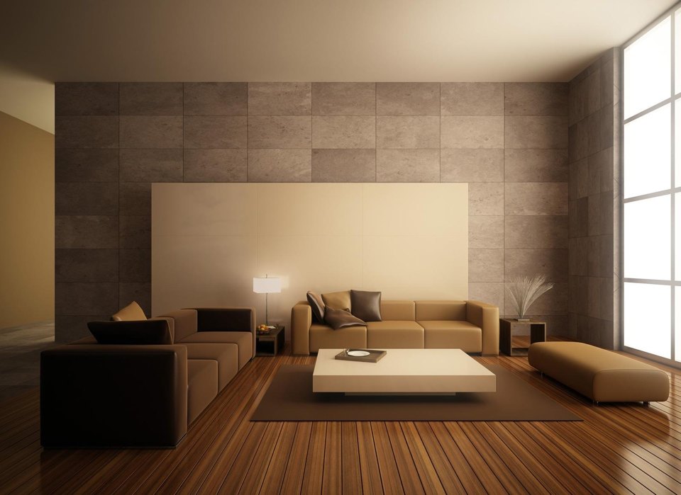
The 21st century was the time when blogging and digital expansion advocated the speeding of these rather slow movements across all the communities. ‘Less is More‘ is the terminology that hyped the entire Minimalist movement into a new global trend. Not just in architecture, but people started applying this formula in every zone in their life from ‘100 items or fewer challenges’ to ‘10 things to throw away guides’ and so on. The term was caught on and now became a household name.The advent of creating user experience based designs that are more human-centric brought a newfound interpretation to minimalism in design. These designs were conceptualized to be sleek, seamless as well as devoid of any visual clutter. With global adaptability, minimalism moved from having a single interpretation to multiple interpretations with a common goal.
Interior design and decor also saw a similar trend in the form of minimalist indoor areas, product design, colour schemes, etc. Another trend was a global migratory population moving to urban cities. This gave rise to the concept of micro and affordable housing which required efficient use of space with multi-utility aspects. These aspects led to further enhancement of minimalism in spatial planning as now the clientele required ‘more’ in ‘less’ space. Minimalism also has seen a prime shift from being aesthetically basic to being functionally efficient.
Why Minimalistic Designs in Homes Created A Large Impact On 21st-Century?
Minimalism is all about keeping spaces simply designed, uncluttered and emphasizing the architectural features. There are many factors why minimalistic designs in homes have created a large impact on 21st-century design thinking, here’s why:-
01 . Minimalist Designs in Home Creates Improvised User Experience 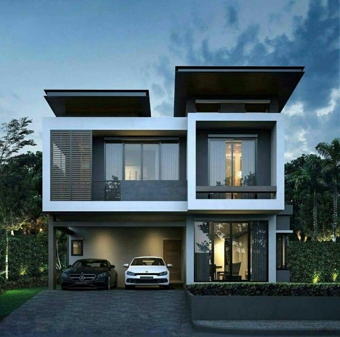
Minimalism in amplifying User Experience
The base concept of minimalism is to keep the original aesthetics of the space and ideate around it without killing its base essence. This allows the spaces to have a better user experience as the spaces are close to their already beautified environment. Minimalism only adds value to the existing substance rather than hampering the whole. An improvised user experience thus ensures a soothing interior and spatial planning.
02. Minimalist Designs in Home Makes the Space More Functional 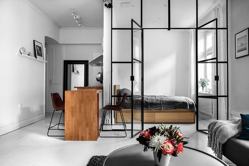
Minimalism Making Functional Spaces
Designing is all about aesthetics as well as functionality. The overall design language, colour schemes, zonal distribution, massing, etc. need to work together to form an ideal end product. When the space in itself looks minimal and calm, this backdrop serves as an ideal phenomenon for functionality while keeping the aesthetics intact. Minimalist designs in home allow an emphasis on clean view, open spaces, simple forms and also adds a sense of dynamicity to the spaces. It inculcates the use of reductive design elements without major decorations or ornamentation, which aims to condense streamline form and structure. Minimal elements create a good user experience by drawing focus on elements and not letting people lost in the clutter.
As said by Robert Brown (Published in Robert Brown Interior Design),“Minimalism allows something other than the space to be the focus. For example, the people in the space or the view from the window might be more important than the room’s decoration; Everything should be functional and add value to space.”
03. Visually Artistic Spaces with Elevated Spatial Quality 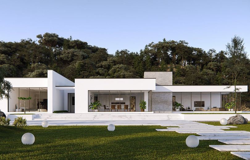
Minimalism with Contemporary Forms
A common myth is that spaces designed with a minimalistic approach are devoid of any attractive aspect. This is highly untrue, a play of texture, materials with a balanced set of color schemes and tones add a sense of subtle eccentricity to your spaces elevating it visually. A subtle exposed concrete wall acting as a backdrop with a pop of colours in the form of furniture elements can in turn add to the visual interest of the space rather than having every single element in a bright tone.
A good minimal design is one that focuses on the smaller details and targets the user’s attention involuntarily towards the core aspect. This design feature of minimalism highlights its design style and helps to achieve visually appealing spaces as well as elevations.
04. Visual Clutter is Avoided 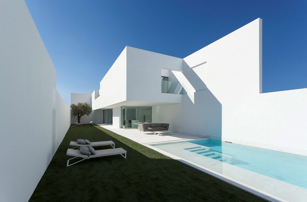
Spaces Free from Visual Barriers
The minimalist design allows having barrier-free spaces with a light environment to accentuate the visual quality. Visual clutter is created when varied elements and textures are merged haphazardly with multiple colour schemes. In minimalism a restrictive colour scheme is used, allowing the spaces to have a positive psychological effect where the spaces look more visually de cluttered than conventional space.
Final Takeaway
Minimalism has seen constant growth in recent decades, a growing digitalization has accounted for providing a platform for new and emerging designs. From small architectural practices to multi-diverse studios, minimalism has been adopted by a wide range of design thinkers and innovators.
The 21st-century minimalism is a varied faceted aspect as its interpretations have reached a newfound level right from its aesthetics to its functionality. Although it might keep updating itself from time to time, minimalism is here to stay!
Now that you have known about minimalist designs in homes, there are other styles as well that has a large impact on this 21st century. You may read them too:
Features of Contemporary Architecture | All you Must Know!
Modern Architecture | Glimpse of its Advantages and Features!!!
Image Courtesy: Image 2, Image 6, Image 7, Image 8
Author Bio
Saili Sawantt – She is an Architect and Interior Designer by profession. Writing is what she treats as her passion. She has worked as an Architectural Writer, Editor, and Journalist for various design as well as digital portals, both national and international. Formerly she has also worked with Godrej Properties Limited (GPL) Design Studio, Mumbai, due to her keen interested in learning about Sustainability and Green buildings. Apart from this, she runs her blog ‘The Reader’s Express’ and is a practicing Architect & Interior Designer.


