Colour Psychology is all about how colours make you feel. All colours have different influences. Some make you feel warm & enthusiastic whereas some gives the feeling of coolness and peace. Exploration of different colours and their feels in right way can help you to choose perfect colour schemes for your home. In the short time, colours can help us to feel instantly relaxed or it can lift our spirits, and in long term it can be a life healing and life enhancing.
Also Read: What are Warm & Cool Colours?
For example, if you paint a room, which stays cool with warm colour scheme, such as red colour, you will feel that room space warm psychologically. Because red colour is associated with flames, heat and fire.
Facts
One scientific exercise that has been done proves the facts regarding colour and temperature. This involves a control group spending time at the same level of activity in the same space, painted first in cool colour scheme and then in warm colour scheme. The room temperature was gradually lowered; the level at which the people first feel cool was 11°C/52°F in the red-orange room and 15°C/59°F in the blue green room. This means that it makes sense to paint warm space in cool colours.
Also Read:
Basics of Colour Theory – Everyone Should Know
Colour Guide: Emphasising Room Aspect and The Way Colour Feels
Colour Terms for Your Home Interiors
Cultural Associations
Colours also have cultural associations. Yellow Colour is associated with spiritually in Buddhist countries, while in Hinduism saffron represents valor (courage) and gallantry along with holiness. Similarly, in Islamic world the green colour is considered as holy. In the entire world masculine is shown as blue except France where red colour symbolises masculinity.
Chromotherapy – Use of Colours to Heal
Colour therapists believe in the healing power of coloured light. The treatment involves shining colour light on the affected part of body. Each colour has its own specialty for area of healing activity. Colour is used for physical, emotional and spiritual healing. It is often used in combination with crystals, acupuncture, astrology and traditional eastern healing techniques.
Colours & Associations
Psychologists and scientists have spent many years to study the subconscious aspects of colours. Colours have both negative and positive effects. For example, the positive side of yellow is warmth and sunshine, but it also represents jealousy and cowardice.
Here are some examples of associations with colours.
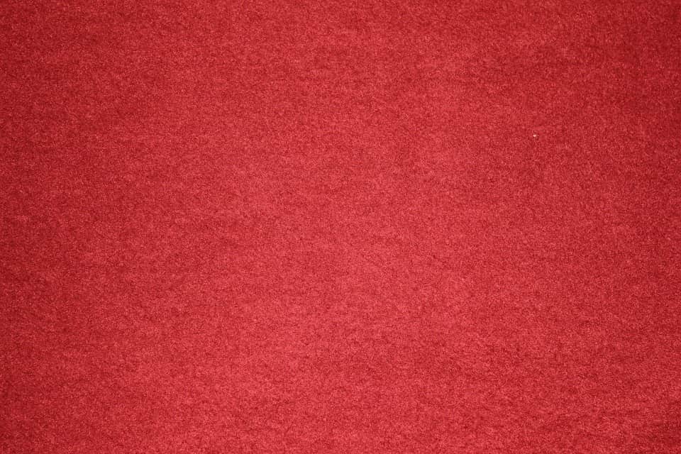
Red Colour:
Red Colour represents the love, life, power, heat, blood, strength, Christmas and revolution.
It can look innocent with white, rustic with orange and brown, seductive as satin and velvet or cheerful in candy strips. It makes a powerful statement. Red Colour is the colour of life and the centre of a flame, of danger, anger, excitement, strength and fire. Having highest wavelength in colour spectrum, children perhaps first recognize and that is why all children love red colour in childhood. Red grabs attention and is good for details and accessories. Red stimulates the appetite, making it ideal for a dinning.
Green Colour:
Green Colour is the colour of youth, growth, ecology, relaxation, balance, recovery and optimism.
It connects us to nature; green colour soothes disturbed emotions and provides restful sleep, which makes it the ideal colour for the bedroom. Though green being a cool colour, it will only make you feel cool when used with contrast warm colour scheme. Green colour is best suited with contemporary colour scheme with plum-purple and chocolate brown.

Purple Colour:
Purple colour is associated with royalty, wisdom, dignity, independence, creativity, mystery and magic.
As purple colour ranges between blue and red it has effect of both warm and cool colours. If purple has more of red colour it comes under warm colours and if it has more of blue it gives cooler affect. Harmonious Purple colour scheme gives cool and comfortable effect. This makes purple colour scheme ideal for bedrooms and studies.

Gold Metallic:
Gold is the most glamorous metallic colour. In the contemporary home gold is most likely to appear as part of an ethnic-inspired colour scheme such as one from India, Thailand and Morocco, where fabrics & accessories are often patterned with gold.
Gold is associated with wealth, worship, glamour, celebration, luxury, solidity, weight, good luck, and shimmers.

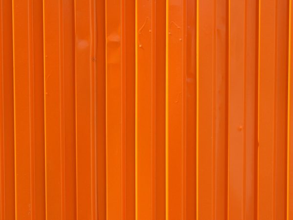
Orange Colour:
Orange Colour represents clay, sunset, amber, marmalade, goldfish, autumn, rust, spices, and clay.
Orange is a warm cheerful colour, symbolizing prosperity, physical and mental energy. It is a good choice for entrance hall and rooms where people gather to socialize. Bright orange colour can cause sensory overload and needs balancing with a cool colour such as aqua, blue or green.
Aqua & Turquoise:
Aqua and turquoise represents ocean, dreams, imagination, sensitivity, freshness, holidays, mountain streams, calm, and cool.
Aqua and turquoise fall between blue & green, and carry with them all the positive aspects of those two colours. Turquoise is the greenish blue colour of an opaque semi precious stone found in the Arizona Dessert. This is a favourite colour for bathrooms, and cosmetic products are often packed in shades of aqua.

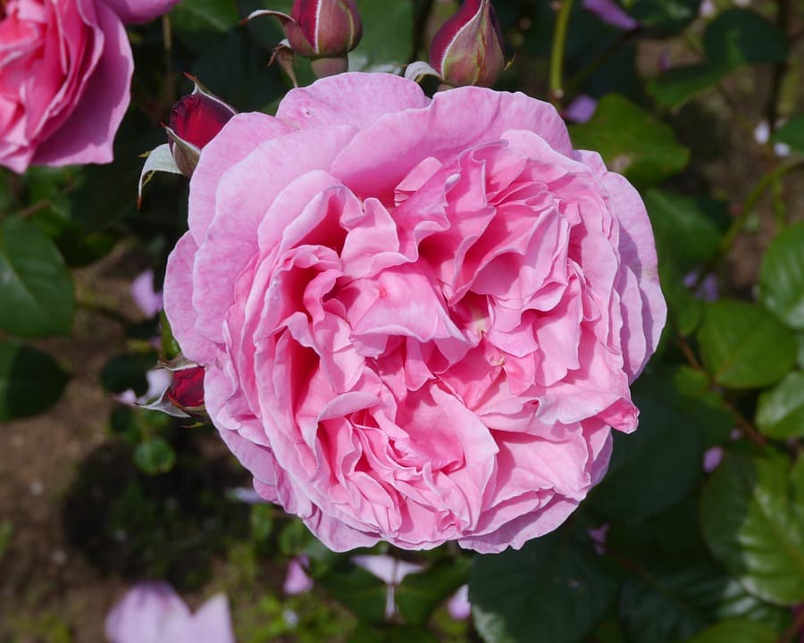
Pale Pink:
It represents softness, meringues, piglets, roses, baby girl, and seashells.
Pale pink brings a warm glow into any room. The colour is associated with sweetness and innocence. It is a life colour, a signal of health and well being. Pink is well suited for use over large areas, it’s character is influenced by other colours with dove grey, pale lemon yellow, faded aqua and terracotta red.
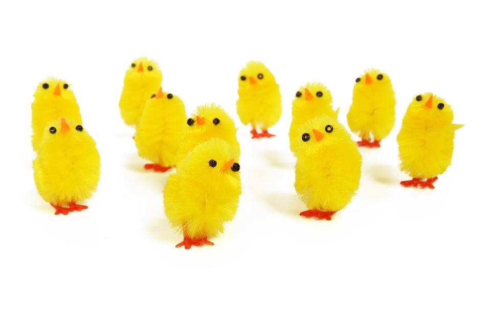
Yellow Colour:
Yellow Colour represents sunshine, gold, warmth, energy, historical associations, optimism, pleasure, and temperature.
Yellow colour is the colour that makes us feel happy. As yellow colour glows and reflects light, which makes it a useful colour for the north side room. Yellow colour is the brightest colour and carries all the positive qualities of brilliance and light. Yellow colour can be used in large kitchen where meals are prepared and served. In a playroom it will encourage generosity and good behaviour and in a workroom it will encourage imagination, creativity and communication.
Black & White:
Black & white present such a strong contrast that they are used over large areas only by the brave. Black and white became popular in the late 1950s and early 1960s, when artists painted their studios white to reflect the light. This style is still cool as ever.
While white represents peace, serenity, surrender and simplicity, black is considered not a good omen in many cultures. However considering black as bad omen is also considered a sign of racism by Blacks across the world, which also appears convincing.
So, black & white represents the negative and positive, good and bad. Perfect example for black and white is yin yang. (The principle of Yin and Yang is that all things exist as inseparable and contradictory opposites, for example, female-male, dark-light and old-young.)
Blue Colour:
Blue Colour represents sea, sky, freshness, cold, sadness, heaven, intelligence and calm.
Blue Colour is associated with peace, masculinity, intuition, cleanliness, trust, authority and intelligence. It absorbs light and makes a room appear considerably darker. Bright blue colour and white are crisp in combination. Because blue colour makes white look cleaner and brighter and white sharpens the edges of blue.

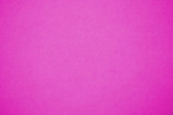
Hot Pink:
Hot Pink represents passion, heat, celebrations, romance, feminism, courage and brilliance.
Hot pink is passionate, feminine and spicy. In nature it is a colour of brilliant desert cactus flower, where maximum visibility is needed to attract pollinating insects.
Also Read: All You Need to Know About Pink Colour for Your Interior!
Brown Colour:
Brown is the colour of earth, wood, stone, wholesomeness, reliability, elegance, security, healing, home, grounding, foundations, stability, warmth, and honesty.
Brown is the colour of so many good things in life. It is a colour of great variations, but is always warm. Brown appears in most rooms as the colour of polished wood, but is often not credited as being a part of the colour scheme.

Choosing a right colour scheme is always confusing, because it’s not just the matter of how colour look/appear, but also how colour can make you feel. After knowing well about different colours and their feel choose colour scheme of your house accordingly.
Also Read:
Hues-Tints-Shades-Tones What is a Difference