


The last decade has seen many changes in the way things have been moving and the interior industry is not an exception to the same. People are becoming more expressive with the ideas they have. When it comes to homes the homeowners go to any extent to ensure that the vibrancy of their abode is a class apart and envy for many. As said by Pierre Bonnard, ‘Colour does not add a pleasant quality to design – it reinforces it’ (p.63). We see a plethora of new colours finding their place in the scheme of things. Let us have a look at some interesting shades and colour themes used in the home décor that designers are vouching for and how they can be experimented with.
01. Moody Shades
No by talking about moody shades we do not mean to talk about the weather. Here we are talking of rich colours like chestnut brown, charcoal blue and burgundy as they add a complex essence to any room, they are incorporated in. With regards to why they are considered moody, it is probably because they have a velvety appearance and the depth of their shade is unmatchable something, we do not see in the primary colours. Whether it is the cabinetry or the walls in small bathrooms these shades rock the look completely.

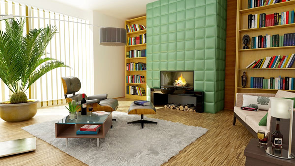
02. Nature Playing
In recent times, lot of things have been kept in mind while deciding the colour theme that works. Keeping the global influences in consideration the designers have noticed that one thing that is being extremely liked everywhere is the serenity and beauty of nature. This means that colours which remind of the sky, water, nature and the ocean are obviously being picked up more. So, make way for greens, greys, browns and muted blues to grant a calming look to your home and pay obeisance to nature and its elements.
03. Blissful White
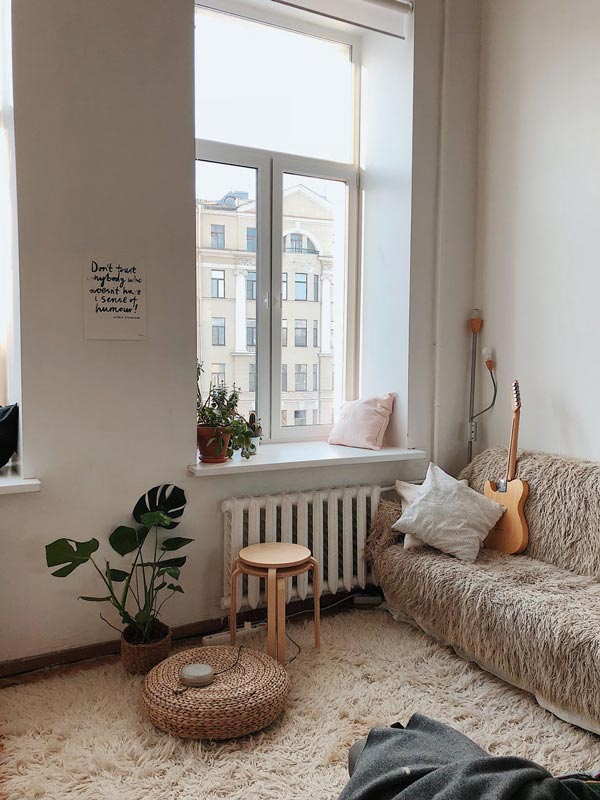
White has and will always be a favorite for the designers. Warmer shades of the same can be seen in most homes if not completely then partially. That is because any shade of white grants a level of peace to your home and no colour can replace that feeling. Whether it is Swiss coffee or antique white shade all of them look fresh, cozy and inviting and that is what keeps their magnetism intact.
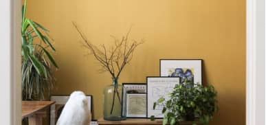
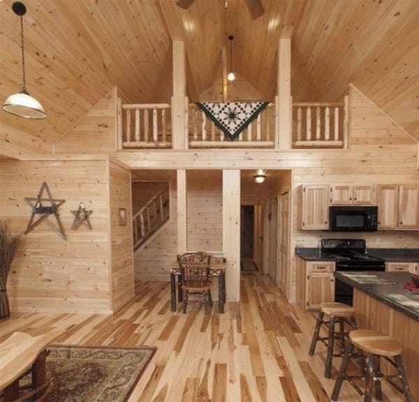
04. Warm Neutrals
It is a surprise that neutral shades are finding favor in the minds of home-owners once again. In fact, designers predict that nowadays neutrals are not going to disappoint in any manner. However, warm neutrals would be more appreciated and cool greys would give way to tans and greiges. Mid-tone brown might be used a lot due to its capacity to make a place look cozy and we won’t be surprised with that.
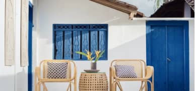
05. Black in Contrast
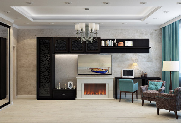
Black is back and in a majorly big way. You may be wondering whether it ever disappeared from the scene at all. However, when used in cabinetry, doors and on accent walls along with rival white the impact is subtle and serene. If it seems that the black you chose is too strong then match with hues of brown or grey. The result would be a beautiful contrast without becoming dramatic or too bold.
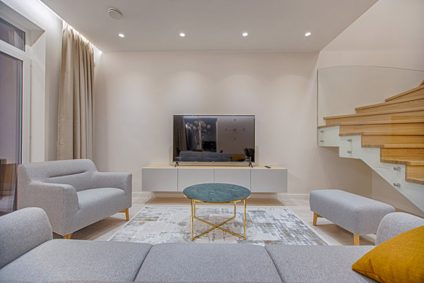
06. Soft Tones
Soft hues and muted colours are not going to be left behind in any manner. Small dollops of soft colours would be seen all over and that would be in accordance with the neutral shades being a part of the décor too. Soft hues, in fact, look charming to those who are slightly wary of going bold but are ok with adding a little bit of colour. Platinum grey is one choice that would be an optimum choice in this case.
07. Wanderer
Moving on we now would talk about the various colour palettes that can be recognized currently. This is for the person who is adventurous in nature and wants the enigma of horizons and the earthy tones of the plains. So, while clays, caramels and browns come from one side, from the other side we have combinations like leather and woven wool blankets. Sun-washed and warm this colour palette is going to be loved by those who need a vibrant feel to their home.
08. Aficionado
This is perfect and appears as if it has just come out of your literature book. Copper, gold and grey are tailored to create an elegant look that is easily noticeable. This colour theme is royal and it evokes an impression of the best things that can be had in life. Ostentatious to a point the combination does not go over the top and that is what makes it charming as ever.
Also Read:
Basics of Colour Theory – Everyone Should Know
What are Warm & Cool Colours?
09. Shapeshifter
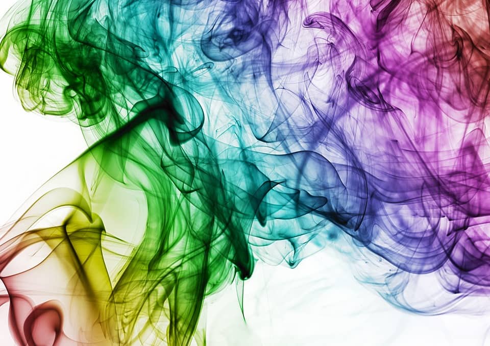
You can call it the king of the mystical zone. Starting from the deep sea to the galaxy everything is a part of this style and strong geometric patterns accentuate its effect. Deep mysterious blues with other similar hues of white and golden are just perfect to get you this awesome palette with a difference.
10. Enthusiast
This palette is for those who are free-spirited and so very fond of breaking rules. This palette shows attitude yet remains harmonious enough. Having bold pops of colours like red, vivid blue and green this palette is sure to impress those who come to have a look. For the designers, this palette gives a totally new impression about maximalism and teaches how to push boundaries using such colours.
Life is beautiful and our homes are usually a reflection of that. The colour tones mentioned above are all set to help you bring a unique touch to the elegance of the place. Most of the designers are rooting for these combinations and if you follow them religiously you are going to get some compliments over your choice.
However, do not go overboard while following any trend as sometimes overuse just spoils the feel of it. Before proceeding with a big change make sure to visualize the same in your mind and only if you are assured of the success of it you go ahead. Instead of just creating a mishmash of colours in your home décor, keep it subtle if you are even a bit confused over the outcome.
Also Read:
How to Choose Tile Colour According to Your Room Colour Scheme?
5 Tips For Designing Colour Scheme For Your Home
Author Bio
Garima Bais – I am a blogger writing on topics like parenting, love, life, beauty and travel. Belonging to a country with a deep heritage India I am an eternal optimist and believe that whatever life gives to you should be taken with gratitude. Do let me know your take on my articles in the form of comments.