There are so many ready made plans available online and also in various books. But no plan in world will fit your individual requirement as:
01. Everyone’s choice, taste, requirements life style and culture will be different.
02. All sites in terms area of land, road facing and north orientation are different.
03. Each family’s budget will be different. Hence copying a plan would be disasterous. We have therefore in series of plans and analysis, anaylsed each plan which will guide the user to understand his plan and make the right choice.
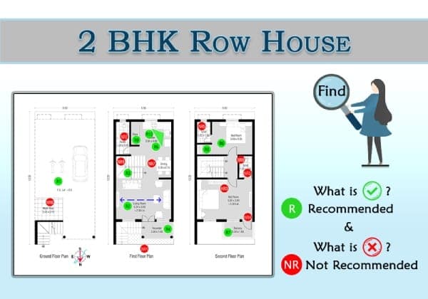
Here we have analyzed and reviewed the design of 2 BHK-Row House admeasuring 180 sq.mt. Good features have been shown as recommended and undesirable features have been shown as “Not Recommended”. The road on which the house abuts and North have also been shown in the sketch.
*R – Recommended
R1 – More parking space available for the parking.
R2 – T.V. is at the comfortable distance from sitting area.
R3 – Staircase location is in the center, easily accessible to other rooms.
R4 – Verandah with 1.6 mt depth is good enough to add space for seating/swing (Zulla) etc.
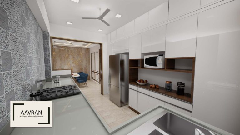
R5 – Wash area (Sink) & fridge (Refrigerator) are located near the cleaning area which is more preferable.
R6 – Bedroom is located in wind direction, which is well designed in the layout.
R7 – Balcony of bedroom is in a North direction which is good to spend more time in the balcony for relaxing, playing games, etc.
R8 – Cupboard along internal wall is always preferred. Cupboard on exterior wall are not desirable as they may get damaged due to moisture/dampness in wall. The plywood will get damaged due to moisture.
R9 – Kitchen has good storage and such arrangements serve better than small separate store rooms which are less functional and wastes space.
R10 – Kitchen triangle is well maintained.
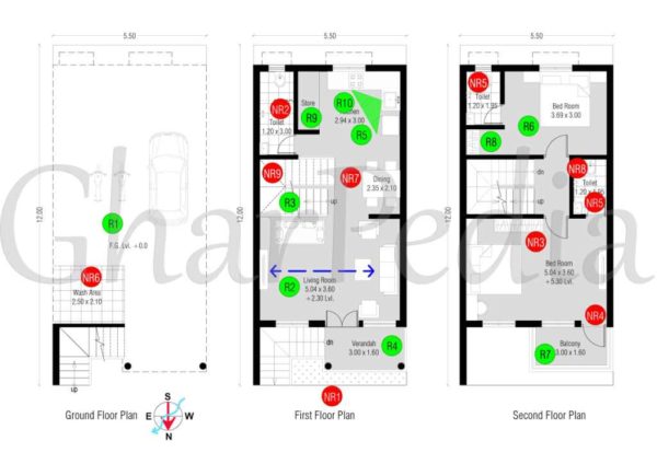
*NR – Not Recommended
NR1 – The main entrance is at first floor which requires many steps to reach, which is not suitable for senior citizens living in the house!
NR2 – In toilet, Dry area should be in front and wet area should be at the end. This is always preferred. The dry area i.e. where the W.C. and Washbasin are placed, are more used in a day as compared to shower area. Thus we recommend the dry area to be designed in front and directly accessible by the user.
NR3 – Master bedroom storage unit (wardrobe) location is not appropriate. It should be in the front dead wall where the T.V. unit has been designed. We personally suggest that the T.V. unit and wardrobe can be designed as a whole single unit.
NR4 – The Balcony door can be shifted to center so that required depth for wardrobe/dressing / T.V. unit can be easily achieved and cross circulation in room can be avoided.
NR5 – Wet area and dry area are not separated.
NR6 – Wash area on GF is not practical.
NR7 – No space shown for common basin near dining on FF.
NR8 – The attached toilet on FF has no ventilation at all which is not desirable. Further it is over dining and hence it would need very good waterproofing. Also, the drainage line will have to be taken from dining and than under the floor on GF.
NR9 – The winders on staircase though not avoidable are not desirable.
Also Read:
24 Tips To Design a Bedroom In Your Home!
12 Tips To Design Storage In Your Kitchen!
10 Tips To Design Patio For Your Home!


